
Gift Set Design
Why "Corporate Black" Rarely Matches Across a Metal Gift Set
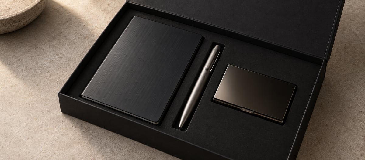
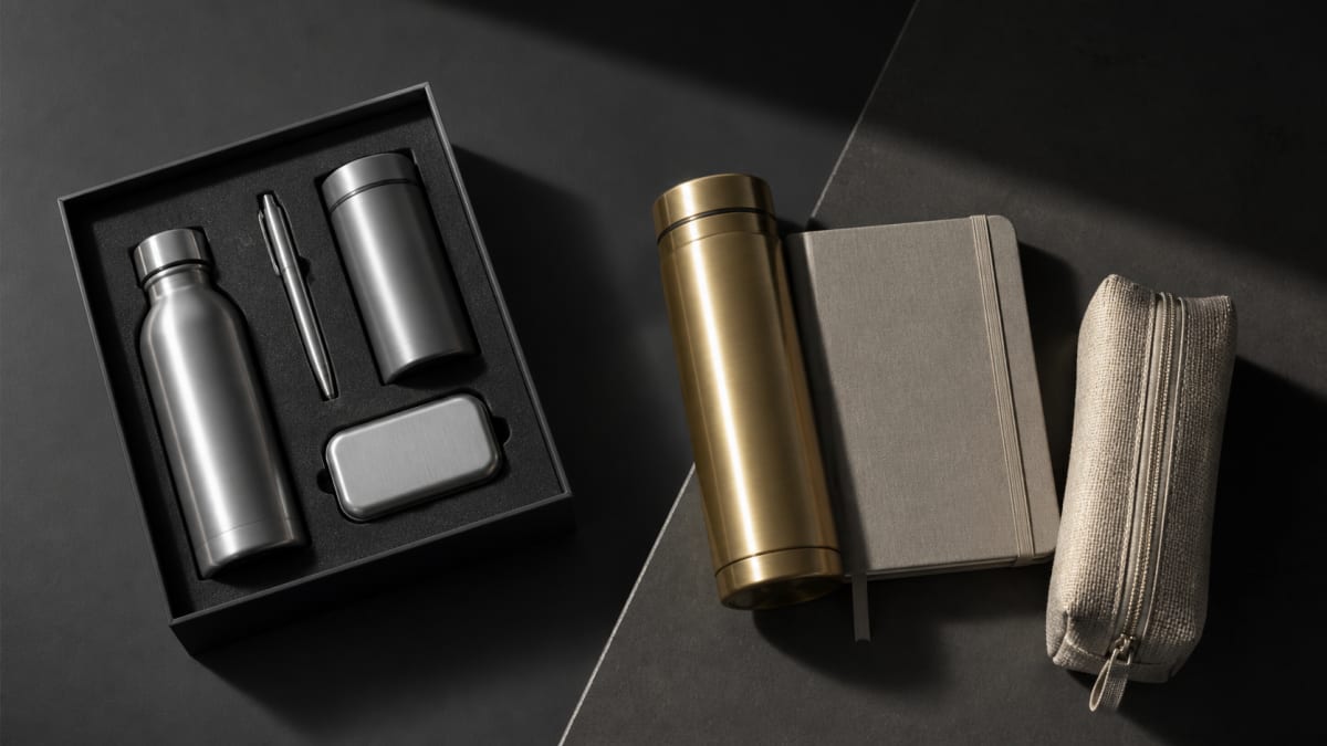
AI-generated editorial visual for Wischos Gift
Quick Answer
Black rarely looks identical across anodised aluminium, coated steel, titanium and printed packaging because each surface reflects light differently. Approve components together, define acceptable variation by material, and aim for a coordinated set rather than an unsupported exact match.
A digital mockup makes colour matching across materials look simple. The pen, notebook cover, card case and box can all use the same black on screen. Physical samples are different: one looks blue-black, another warm and reflective, the titanium reads as grey, and the box absorbs light.
That does not automatically mean a supplier made a mistake. The substrate, surface preparation, colouring process, gloss, texture and viewing conditions create the visible result. Pantone itself explains that colour appearance changes with the material and that some colours are not achievable on every material.
The goal is a set that looks coordinated, not a collection of near-misses.
Key takeaways
- A Pantone reference communicates intent; it does not guarantee identical output on every material.
- Black anodised aluminium, coated steel, titanium and printed packaging create colour in different ways.
- Gloss and texture can make two technically close colours look visibly different.
- Physical components should be reviewed side by side under consistent conditions.
- A tonal family or deliberate contrast can be more convincing than a near-match that looks accidental.
Why one colour reference produces several physical blacks
A colour code is not a universal manufacturing recipe
Pantone uses separate systems because materials and applications behave differently. Its Pantone Matching System is primarily associated with graphics and packaging, while the Fashion, Home + Interiors system includes references intended for products, coatings and other hard surfaces. Pantone also states that the appearance of a colour can change according to the material on which it is produced.
That distinction matters when a brief moves from a printed brand guide to metal. A PMS reference still gives designers, suppliers and buyers a shared direction, but it does not become an anodising formula, a PVD recipe or a guarantee that a printed box and metallic surface will look identical. Ask what physical result each approved process can produce from the target.
The substrate remains part of the colour
Printed ink can form an opaque layer over paper. Anodised aluminium combines an oxide layer, colourant and underlying alloy. A coating on steel sits over a reflective substrate, while natural titanium contributes its own metallic grey. Getting four surfaces to look related is as much a design decision as it is a colour specification.
Gloss, texture and viewing conditions change the comparison
A brushed surface changes with the lighting angle, a blasted finish diffuses reflections, and a polished dark coating creates sharp highlights. QUALANOD notes that measurements on samples with substantially different gloss can diverge from visual perception. Screens add monitor calibration, camera white balance and editing to the uncertainty. Use digital proofs for layout and direction, not final physical colour approval.
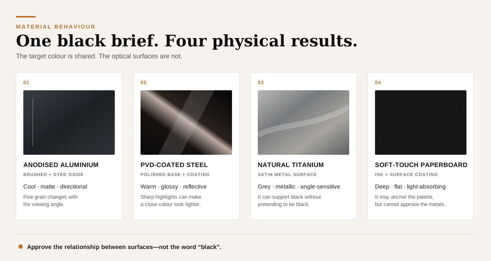
What black means on four gift-set surfaces
"Black metal" is not a sufficient production specification. The buyer needs to know the base material, how the colour is created and which variables are likely to change the result.
| Surface | How the appearance is created | Main sources of variation | Strongest approval evidence |
|---|---|---|---|
| Black anodised aluminium | Colour is incorporated into an anodic oxide layer on aluminium | Alloy, manufacturing route, pre-treatment, texture, colouring and sealing | Process-specific physical sample, with agreed appearance limits where needed |
| Black coated stainless steel | A dark PVD or other coating is applied over steel | Coating system, substrate preparation, gloss, geometry and film consistency | Sample made with the intended substrate, coating and geometry |
| Natural or coloured titanium | Natural metal, oxide colour or applied coating | Grade, original finish, oxide/coating process and viewing angle | Physical sample with the exact finish named |
| Printed presentation box | Ink, coloured paper, laminate or soft-touch coating creates the black | Stock, coating, ink system, absorption and print process | Printed production proof on the specified stock and finish |
Black anodised aluminium
Anodising converts the aluminium surface into an oxide layer, but dye alone does not determine appearance. Alloy, manufacturing route and whether the surface is brushed, etched or blasted also matter. The Aluminum Anodizers Council recommends specifying alloy, temper and finishing stages rather than a colour name alone. Approve intended parts together and retain a physical reference.
Black stainless steel
Stainless steel is not naturally black. Specify whether the colour comes from PVD, another coating, paint, printing or chemical treatment. Even PVD is a deposition method rather than one universal black: preparation, substrate finish and geometry influence the result.
For the processes, see Surface Finishes for Metal Corporate Gifts. A dark coated steel part should not be expected to reproduce anodised aluminium simply because both are labelled black.
Titanium and titanium-coloured finishes
Natural titanium usually reads as metallic grey, and "titanium colour" does not prove titanium content. If it is dark, name the colouring process. Natural titanium may work better as a deliberate accent than an imitation black.
Printed paper and presentation boxes
Packaging may offer the clearest route to a printed brand colour, but paper and coatings still differ in depth and gloss. Pantone notes that the same colour changes between coated and uncoated paper. The box can anchor the palette, but should not approve every metal process.
Choose the right matching objective
Before sampling, decide which of three outcomes the set actually needs.
| Matching objective | Best used when | Approval question |
|---|---|---|
| Close match | Parts use similar substrates, textures and compatible processes | Do the parts appear acceptably close under agreed viewing conditions? |
| Tonal family | Materials differ but should share a dark, restrained visual language | Do the variations feel related and deliberate when the box is opened? |
| Intentional contrast | Natural metal or a clearly different finish strengthens the hierarchy | Is the contrast strong enough to look designed rather than mistaken? |
A close match works best when components share enough material and finish characteristics for meaningful comparison. Matte anodised aluminium and high-gloss coated steel are often better treated as a tonal family. Deliberate contrast is also valid; the danger is an almost-match that looks accidental.
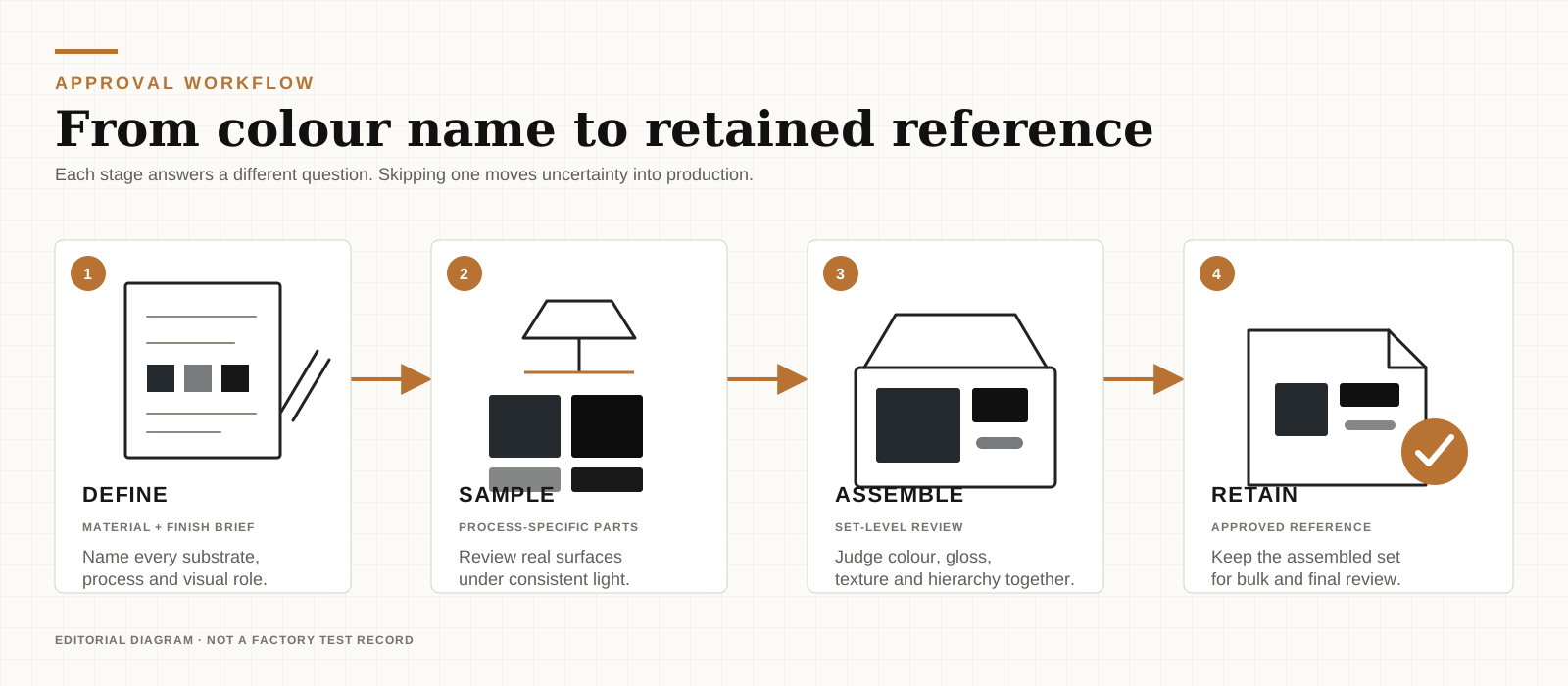
A six-step approval method
Step 1 — Name every substrate and finish
Replace "black metal" with a component-by-component description: base material, texture, colouring or coating process, and intended gloss. If a part has only a marketing colour name, ask what creates it.
Step 2 — Define the visual hierarchy
Choose the anchor: the box, main product or primary branded item. State whether the other components should closely match it, support its tonal family or contrast with it. This also helps determine whether the brief should use an all-metal or metal-led gift-set structure.
Step 3 — Approve process-specific samples
A brand reference points the way; the physical sample is the approval. Do not use an aluminium chip to approve coated steel or a paper swatch to approve titanium.
Step 4 — Review the complete set under consistent light
Place the components together, preferably in the box, against the same neutral background and under consistent light. Compare hue, gloss, texture, reflectivity, logo contrast and visual weight—not colour alone.
Step 5 — Define acceptable variation
Keep the approved reference and, where useful, lighter and darker limit samples. Note what they control: colour, gloss, texture or brushing direction. Use ΔE only when everyone shares the same measurement method and acceptance rule. Otherwise, do not invent a number to look precise.
Step 6 — Retain the approved assembled set
Keep one approved assembled set, or a clearly documented equivalent, for bulk review and final assembly. Individual samples establish component quality; the complete reference establishes whether the parts work together. A workable custom metal gift brief should connect material, finish, branding and packaging before production release. Use the metal corporate gift quality checklist for the wider pre-production review.
Illustrative example: one black brief, four surfaces
Illustrative scenario: The following example is hypothetical. It demonstrates how a brief can be improved; it is not a Wischos customer case or production claim.
The original instruction—"Make the whole set black and premium"—covers four surfaces:
- a brushed, black anodised aluminium notebook cover;
- a polished, dark PVD-coated steel card case;
- a natural titanium pen;
- a soft-touch printed rigid box.
Each component looks fine on its own. Together, the aluminium reads as cool matte black, the steel as warmer reflective black, the pen as metallic grey and the box as deep flat black. The brief created four interpretations of one word.
The revised instruction changes the objective:
Cool charcoal tonal family. The box is the brand-colour anchor. Matte black aluminium should relate to the box; dark steel may be more reflective; natural titanium is permitted as a deliberate metal accent. Review all components together before bulk approval.
The revision does not claim identical surfaces. It gives each one a role and creates an answerable approval question: does the assembled set look intentional? Named surfaces, a tonal relationship and an assembled review provide more control than an undefined request for "exact black".
What to put in the colour brief
Until a downloadable tool is available, the following checklist can be copied directly into a project brief.
Project / set name:
Destination market:

Brand colour reference and colour system:
Physical reference available: Yes / No

Component 1
- Item:
- Base material:
- Mechanical finish or texture:
- Colouring / coating process:
- Intended gloss:
- Role: anchor / close match / tonal support / contrast

Repeat for every component and the packaging.

Set-level objective:
[ ] Close match
[ ] Tonal family
[ ] Intentional contrast

Approval conditions:
- Viewing light and background:
- Reference sample ID:
- Limit samples or written appearance limits:
- Logo method, size and position:
- Complete assembled sample required: Yes / No
- Final approver:
- Approval date and version:
Five common approval mistakes
- Sending one Pantone number without naming the materials. It communicates a target, not the intended relationship between surfaces.
- Approving supplier photographs separately. Cameras, lighting and editing make comparison unreliable.
- Ignoring gloss and texture. Numerically close colours can still look inconsistent.
- Treating natural metal as failed paint. Titanium may work better as a deliberate accent.
- Starting bulk without an assembled reference. Component approval does not prove that the set is coherent.
That branding decision belongs on the real surface too. Laser engraving and colour printing have different capabilities, and neither should be approved only from a digital overlay.
Frequently asked questions
Can anodised aluminium match a Pantone colour exactly?
Not as a universal guarantee. A Pantone reference can guide colour development, but alloy, pre-treatment, texture, gloss and the anodising process affect the result. Approve a physical sample made with the intended aluminium and finish, then define the acceptable production range against that sample rather than relying on the code alone.
Why do two black anodised parts look different?
The parts may use different alloys, manufacturing routes, surface preparation, textures or process conditions. Their geometry can also change how light reflects from them. If they must appear together, specify those variables where possible and compare actual parts side by side instead of approving two separate photographs.
Is PVD black the same as anodised black?
No. Anodising creates an oxide layer on aluminium, while PVD deposits a thin coating on a suitable substrate such as steel. The processes produce different reflectivity, colour character and edge behaviour. They can belong to the same tonal family, but the word "black" does not make them physically equivalent.
Should packaging match the metal or the brand colour?
Choose the hierarchy before matching anything. Packaging can act as the closest brand-colour reference while the metal components form a coordinated tonal family. If a metal item is the visual anchor, the packaging can support it instead. The right choice depends on which element should lead when the box opens.
Can a digital proof approve metal colour?
No. A digital proof can approve layout, approximate direction, logo scale and placement, but screens and photographs do not reproduce physical reflectivity or texture reliably. Final colour and finish approval should use the intended material, process and physical sample, reviewed with the other components under consistent viewing conditions.
Approve the relationship, not just the colour name
"Corporate black" is useful shorthand, not a finished specification. Colour matching across materials starts with a name for every surface, a choice between close match, tonal family or intentional contrast, and physical components approved together. Use the checklist above to define that hierarchy and approval method before requesting a final quote.
More Articles
Ready to order?
Browse the Catalogue or Send a Brief
Curated metal products and gift set concepts for B2B programs. Custom branding, packaging, and sourcing support available.